copyright 2019 by Russ Hodge
This piece was motivated by my recent correspondence with Jens Wohlmann, a talented young scientist working in Norway. It follows up on two previous pieces concerning phenomena I call “ghosts”, which play crucial (and often disruptive) roles in scientific thinking and communication. They can be read here:
A brief overview in interview format
A more detailed introduction to the problem of ghosts and examples of various types
The letter from Jens:
Dear Russ,
It has been a while since I wrote you but I have been following your blog and I was actually thinking that I should write you about some “observations” concerning your “ghosts” – so I will use your mail as a reason to finally do so:
Listening to some recent talks by scientists of our institute I came across “forces” you are most likely aware of but which are new to me – in the terminology of “ghosts” one could probably describe them as “goblins” or “deranging ghosts”. I think of drawings and models of structures of interest in papers, presentations, schemes and so on. One example is when parts seem to be totally out of scale.
For example, a small GFP tagged Protein will be marked by a small “star” as a marker attached it, although the GFP itself may be double the size of the protein of interest. The same is true for markers on antibodies. In EM we put a dot on a Y-shaped structure, but the whole antibody has a size of 15nm. Since the particle may be 10 or 15nm it should be as big as the antibody. Even the orientation in the illustrations is kept consistent – always with the binding end pointing “outwards”. This confuses students if steric hindrance is important, because in reality the structure is most likely a chaotic, multi-layered coat oriented in all possible directions.
Another nice example can be seen in schemes of transmembrane proteins, pores or receptors. Most of the time the structure of interest is presented as a huge thing standing alone on the cell surface (because it’s so important), and the membrane is represented as a thin line – but in reality the size of the molecule is only slightly larger than the membrane, and it may be entirely inside it. Of course schemes need to be simplified, but this emptiness often gives the impression that cells are empty membrane bubbles, whereas the cytosol has an incredible high protein concentration and is full of fibrers and structures….
I think this “out of scale” representations can result in similar problems as your ghosts and they can be seriously found everywhere.
Best, Jens
My response in four sections:
Hi Jens,
I think you’re absolutely on the mark with your observations about the peculiar ways biological entities are represented in images or schemes. The examples you gave are excellent. At the moment, I’m exploring ways of mapping some of these problems into the conceptual framework of “ghosts”. Below I’ve broken this down into a few related points.
1: Overview
To me what makes this so important is that we use images and schemes to represent complex concepts, but obviously ideas undergo important transformations as they are translated into visual form. Relationships that we know are three-dimensional are pressed into two. Key points are brought into the foreground, while others fade into the background or disappear altogether.
And dynamic processes are broken into static frames. What happens a lot like the difference between a musical phrase and the way it is represented in a score; composers and musicians know that tones aren’t “particles” just lined up in sequences (they are “waves” integrated into longer “waves” – phrases of different lengths in different voices). I’ll be talking about thinking of cellular processes in terms of “phrases” and other musical terms like polyphony, harmony and dissonance in my upcoming talk in Oslo – this is a much larger discussion.
The ways we translate concepts into images, language or mathematical models are highly susceptible to influences by effects of styles and genres, which reflect experience, habits and expectations and make communication possible. Such “styles” guide the way a thinker produces an image (or text) and the way audiences unpack it to map information onto their own conceptual frameworks. It’s interesting that most of the time, the two are combined: when a speaker shows a slide, he will say something about it; figures in texts are accompanied by legends. The idea behind this, I think, is to ensure that the audience decodes the meaning the way the author or speaker intended.
And here the problem of “ghosts” rears its head – inevitably, a lot of meaning is hidden. Some of it lies in the invisible conceptual architecture that lies behind packing and unpacking; some of it lies in the style or code. And an awful lot of it comes from differences in the way the author and audience have their knowledge organized. As an electron microscopist, you have an extremely high-resolution version of what a cell is in your head; you know how “full of stuff” this landscape is. And you work at a scale where the relative sizes of molecular objects are incredibly important.
But you’ve seen enough talks and read enough papers to be familiar with the styles of most schemes that you’ll see, and you know how to translate them into your own conceptual models. Sometimes they won’t fit. You surely find it equally difficult, sometimes, to translate your ideas into schemes that other people will understand. This is true for all kinds of communication; what makes it interesting in science is that it’s often possible to pinpoint where things go wrong and identify the ghosts very clearly.
I think that recognizing this is essential to the scientific process. Hidden architectures are essential to meaning. Individual scientists – even in the same field – have their knowledge organized in different ways. This creates subtle differences in their views of models that are analogous to variation in biological systems. When these differences collide and become exposed, they lead to refinements and revisions in models. This can be a powerful, efficient, creative process if we are aware that they are there. The problem is that most people don’t consider them consciously when they communicate or teach, and don’t actively look for ghosts that can disrupt communication. If the structure of a collection of concepts remains invisible, students will have to assemble it themselves, and a lot of things can go wrong in the process.
So now I’ll try to break down some of the things you’ve mentioned.
2: The problem of “translation” between conceptual models, language, and images
Recently a number of scientists have asked me to create drawings for their talks. They describe something, I try to draw it – FAIL! – they tell me what to fix and I try – FAIL! – and so on, until we finally have it right. This happens even when they pre-draw a scheme, because somehow I don’t seeit the way they do.
There are several things going on here. First, if the scheme represents a model of a physical system, such as a molecular structure, a complex of molecules or a process, the scientist is probably thinking of it visually and spatially but simultaneously functionally. Whatever function he is considering at the moment (foreground) plays a big role in the degree of detail that is in his mind and he wishes to be displayed in the image. So if I’m just trying to show what molecule binds to what, it may be enough to represent single components as generically as Lego blocks. A lot of times in these schemes, the pieces are not even placed in the right relationship to each other – which is understandable given the difficulties of crystallizing complexes. I was astounded many years ago to learn that biochemically, it was even hard to determine how many copy numbers of a specific protein there are in a particular complex.
(For the nerds: Even when crystals are made, weird Fourier transformations (math!) have to be applied to turn X-ray diffraction patterns into electron density maps, then sequence information and homologous structures are applied to find alpha helices, beta sheets, and tell what belongs to what.)
Anyway, in diagrams, very simple models may be sufficient until fine details of their surfaces and issues like steric hindrance suddenly become important in understanding something.
When starting out to make a scheme, I think it’s important to understand that our minds are constantly shifting between considering different types of functions, rapidly shuffling concepts between the foreground and background, and doing so at different scales. So there aren’t “one-size-fits-all” models. Different levels of structure ought to be embedded in each other and linked, but as you well know, most methods in biological don’t give us scalable views of things like Google Earth; if we want to study a new level, we have to change methods. That means, inherently, that models are necessary not only to classify, generalize and describe or depict the components of a system, but to link them to higher and lower levels of structure. Conflicts arise all the time because they are connected by a hidden web of assumptions and structures.
In your work with biologists, yeah – it would nice to have (3D) EM pictures of everything everybody is studying, and even real (3D) structural views of the molecules, but it’s not always necessary to make a certain point.
To give you an example, below I’ve inserted three models of the same thing: a nucleosome. Each of these was clearly developed to emphasize a particular relationship between structure and function. But those relationships lie at different scales, which has dictated the level of detail that is included, what lies in the foreground and background, and influenced all sorts of stylistic decisions.
This helps explain why some of the examples you gave don’t work, or are dissatisfying – people are often lazy about making their own images; they borrow them from other people and don’t check that they are really made to fit the point at hand. As a result, images may not convey the information they’re really aiming at.
Please note: I acquired these images from diverse papers; if any author has a problem with their use, contact me and I will replace it.

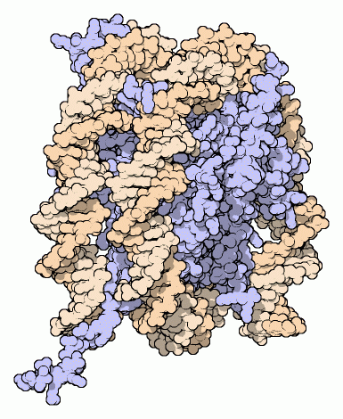


There are several issues to consider here. First, A researcher has some sort of visual representation of the system in his head, but when he tries to draw it or create an image he may realize that he hasn’t probed that internal visualization in detail. In fact, the most detailed images here required a computer: the scientist doesn’t have all of this in his head – at least not in this form. This means that there are all kinds of gaps in his concepts, which is interesting because he may be completely unaware of them until he actually tries to create the image. This is one way that engaging in communication can generate entirely new scientific questions. (“Oh, I didn’t know that, or I have no idea where this component belongs – how can I figure it out?”)
When trying to describe something in words, language is notoriously bad at capturing a lot of types of visual information. Part of this has to do with the linear nature of language: you can describe a row of dominoes, which are lined up in a sequence, but if they’re scattered randomly across a table we don’t have enough words for complex two-dimensional shapes, let alone 3D. Or try finding a criminal based on a verbal description. Or drawing a face based on one – the “police artist” problem.
Third, the prerequisite to communicating any model well is having it clearly in your mind, and mapping it onto language in the clearest possible way given your expectations about the audience. A lot of scientists don’t understand all the things that can go wrong in this mapping process.
3: Ghosts in visual styles and genres
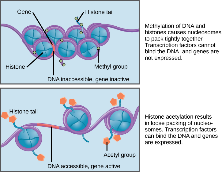
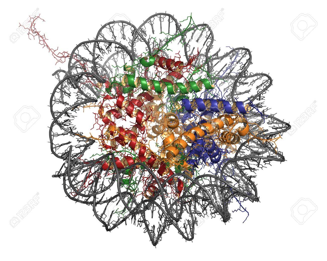
A biologist would see the image below much differently than a non-scientist. When I show this to groups of scientists, they all recognize that they are looking at something on the molecular scale. They immediately recognize the double-helix structure of a DNA molecule, and notice that its circular, wrap-like structure encloses ribbon diagrams (simplified schemes of proteins). This probably makes the structure a nucleosome. They will probably assume different colors of the ribbons are meant to represent different proteins – here, four of them. If you assume that this object has a front-back symmetry, then you might guess that there are eight histones in the complex.
Very little of this information is contained in the image per se: it’s extra knowledge that the viewer has to have to decode the scheme.
There are lots of other, very basic “ghosts” related to two-dimensional images you need to be aware of to “understand” and explain this object. We’re used to translating 2D into 3D; shading and shadows create an illusion of depth, but some of this is cultural. Is it very thin or thick? And so on.
But there’s another enormousghost in this image, truly invisible in the most literal sense, that no scientist I’ve shown it to has detected so far. What’s all that white space around the thing? It can’t just be empty space. Nucleosomes only exist in a very specific biochemical environment – that of the nucleus, composed of all kinds of other molecules, a specific pH, and so on. So this object and its nature are contingent on a lot of invisible things that aren’t in the image at all. They are, however, somehow encoded in the image.
4: The “fudge factor”
This type of ghost is something my good friend and mentor Jim Hartman came up with over a lunch last year. It’s omnipresent – there in every example we’ve taken so far – and very complex because it mixes lots of types of other ghosts. In some ways it comes really close to what you called “goblins”.
“Fudge factors” arise from the fact that everyone knows that language, concepts, models and images don’t map onto each other very well. So whenever you describe something, you’re packing some thought into language or an image, transmitting it to someone else, and expecting them to unpack it in a very similar way. The representations are usually highly simplified – highly complex processes are reduced to a shorthand. If everyone translates them the same way, this works fine. But hidden within are lots of ghosts that can make things go very wrong. Think how hard it would be to truly adequately describe – in language – an experimental protocol to someone like me, and expect me to do it right the first time. I barely know a pipette from an electron microscope.
Here’s an example of a text loaded with “fudge factors,” concerning a biochemical signaling pathway that I recently deconstructed with my friend Uwe Benary:
A Wnt stimulus leads to the inhibition of the destruction complex that normally targets β-catenin. In consequence, less β-catenin is degraded and more β-catenin is able to enter the nucleus. There it regulates the expression of specific target genes.
Any experienced molecular biologist recognizes that dozens (hundreds? Thousands? Millions?) of steps are omitted from this description. To list just a tiny fraction of them: to receive a signal, lots of things have to happen to prepare a cell to bind the Wnt ligand. Lots of types of molecules (including its receptor) have to be presents, in the right quantities. They have to be arranged in often huge complexes – many of whose parts are unknown – that are constantly undergoing dynamic rearrangements. For beta-catenin to get involved, specific sites in its binding partners have to be chemically modified; once the complex dissolves, it is somehow transported to the nucleus and through pores, all along the way interacting with other factors and releasing them again. It has to find its way through masses of chromatin to find specific targets, a process which is hardly understood at all, and then participate in assembling the transcription complexes that will read the DNA sequence and build RNAs. It hits a lot of the “wrong” targets.
There are more types of ghosts: a scientist knows that we are not really talking about single molecules, but a generic model of how whole populations of molecules behave. Etc. Etc.
This type of highly oversimplified account is only meaningful within the context of a particular function of focus – just like the nucleosome image – and because people agree on how a model should be packed into language and unpacked again. Students won’t know all the missing pieces when they hear this, and the ghosts will lead to lots of misunderstandings. They may mistake the shorthand for a complete account of the process.
Interestingly, this skeletal shorthand reflects the history of the beta-catenin model. The bits of the story that are mentioned represent major discoveries over the past couple of decades. Digging out the missing steps has been the subject of an amazing amount of research; still, when the story is told, it’s arranged on the foundations of historical ghosts: what should be pulled into the foreground, what can be “safely ignored,” and what is simply unknown. This shorthand is a perfect example of the operation of fudge factors, a process that constantly generates ghosts.
There are always fudge factors – even in the most detailed experimental protocols, which are based on a researcher’s knowledge of tools and procedures and a large corpus of experimental and biological knowledge. I think they are likely a major cause of difficulty in reproducing experiments. And a lot of disagreements between the preeminent scientists in a field are waged over fudge factors – listening to debates can be extremely confusing if they are not exposed. Sometimes for the non-insiders, it’s hard even to tell what they are arguing about.